Numbers Matter. Here’s How to Use Them More Effectively.
The Stickiness of Comparisons: Peru vs Texas
Rapid fire: what is more sticky?
A) We lost 25% of our customers this year.
B) We are losing 1 in 4 customers; that’s worse than Blockbuster when Netflix came out.
A) Peru is 496,000 square miles.
B) Peru is almost twice as big as Texas.

A) By having a warm up exercise before class you effectively add 10 minutes of instruction.
B) By having a warm up exercise before class you are adding 7 weeks of incremental instruction, enough to teach 7 new subjects.
A) We did 5,275 health screenings this quarter.
B) We did 5,275 health screenings this quarter, enough people if they were stacked up would be as tall as Mt Everest!

I hope by now you see the impact of drawing analogies instead of just inserting stats. This guide will walk you through how to do this effectively.
Backstory: Why Does This Matter?
I have built a myriad of executive presentations, board meeting presentations, and even an S1 presentation (the document used when a company goes public). I also teach an MBA course on Storytelling with Data. And the one thing I avoid is complex numbers.
This may sound counterintuitive…
- Don’t all of these important presentations need data? Yes, absolutely.
- Don’t you need to tell a story with your data? Yep!
- Don’t numbers drive insights, discussion, and change? Always!
When I was helping take Traeger public (which is a wild story in itself and documented in detail here) one of the most referenced charts by analysts was this simple chart here:
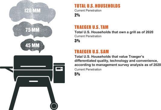
It shows that Traeger is only in 2% of U.S. households, in 3% of households that have a grill, and in 5% of households interested in a Traeger.
Analysts were blown away by this. I could imagine them saying to themselves: “A $600M grill company that’s only in 2% of households?! What if they got in 4% of households?! 6%? 10%? This is a massive opportunity.”
The chart itself is simple and on-brand. I could have taken it one step further and made some other comparisons:
- Traeger is still in its infancy – it’s like Apple in the 1980s right before they launched Macintosh.
- Traeger is still unknown – in a room of 100 grill owners, only 3 would have one.
- Traeger has a massive opportunity – more people had Teslas delivered to them THIS YEAR than own a Traeger
Contrast this with what most people would be tempted to put into a presentation:
- Traeger has sold 2,041,214 grills to date (hard to grasp)
- Traeger sales have increased 28% each year for the last four years (is this good? bad?)
- Traeger sales could double in the next few years (really? Is this grill market big enough?)
But when you just say that this massive company is only in 2% of households, which is about how many people had Teslas delivered this year, it really tickles the imagination.
This is why using numbers and comparisons effectively matters.
Austin & Jason’s 5 Rules for Using Numbers
So let’s suppose you’re working on a presentation and want to make it better. Here’s our 5 rules to follow:
Rule #1: Do You Need a Number?
It’s often tempting to show numbers or a chart, but sometimes you can drive more impact by removing numbers.
Typical Example: We had a 10% decline in sales last year.
Application Example: Companies that have declines in sales like ours typically have to lay off staff.
Rule #2: Use Small Numbers.
The smaller the number, the better. Like 1-10 should be your sweet spot. Avoid large numbers as they are hard to conceptualize.
Typical Example: We sold 110 subscriptions this quarter, up from 100 last quarter.
Application Example: We sold an incremental 10 more subscriptions this quarter without adding any additional sales support, which means our sales team all get a trip!
Rule #3: Avoid Decimals.
People don’t care about decimals. Plus they are hard to understand. Just round up or down.
Typical Example: Bing has 2.81% market share.
Application Example: Bing has 3% market share.
Rule #4: Bring it Home.
Most people care about themselves and what’s around them. When it’s abstract or far away people just don’t care.
Typical Example: 1 in 3 people in this class will likely drop out.
Application Example: Look to your left. Now look to your right. Statistically either you or one of the two people you looked out will have dropped out of the school by the end of the semester.
Rule #5: Draw Comparisons. Numbers are more impactful when they are relatable and sticky. It’s hard to remember how deep the biggest ocean trench is, but it’s easy to remember it’s bigger than Mount Everest.
Typical Example: The Mariana Trench is 10,994 meters deep.
Application Example: The Mariana trench is the biggest ocean trench in the world, which is twice as big as the Matterhorn, larger than Mount Everest, and if it were a mountain a plane at cruising altitude would crash into it!

In Conclusion
Numbers matter. But so does stickiness. The better you can be at effectively using numbers the better you can be at driving impact.
For additional resources on storytelling with data, here’s three extremely helpful ones:
- Unwritten Business Guide: 5 Ways to Tell Better Stories with Data (written by Austin & Jason)
- Making Numbers Count: The Art and Science of Communicating Numbers by Chip Heath and Karla Starr (this was recently published and based off the popular Wharton business class)
- Storytelling with Data: A Data Visualization Guide for Business Professionals by Cole Nassbaumer Knaflic (this is one of the textbooks for Jason’s Storytelling with Data course)

