How Winetasting and Storytelling with Data Intersect
Recently I went out to dinner with some coworkers and they were talking about wine, expounding on the differences, their preferences, and who had drunk the most expensive ones. I decided to do a little experiment – I ordered four glasses of wine for the table but didn’t tell them the price.
The first glass came, which was the most expensive, and they tasted and took notes. Strong flavor, hint of cinnamon… you get it. Then the next glass came, which was the least expensive. Again they’re noticing subtleties – this is aged longer, hint of rosemary, etc. Some thought it was more expensive, others less.
Then for the trick – the third glass, you guessed it, was the exact same as the second. The least expensive. They had no idea. Again they’re expounding. Then the fourth glass comes, the exact same wine as the previous two, and once again, everyone was talking about how different the properties of glass #3 are from the first two wines. By this point, I was suffering a painful knot from holding in my laughter.
They all got it wrong. Our table was howling with laughter, obviously exacerbated from the wine, when I told them what I had done.
Most wine drinkers aren’t true experts, even though they think they are. And here’s the point – even if you work in data, regularly write reports, and are really proud of your last presentation – when was the last time you did some training? Are you a data sommelier without schooling? Probably not. This article will provide you with a nice guide and principles, and hopefully this can be the beginning of refining your craft.
Storytelling with Data
To help share five ways to tell better stories with data, I’m going to use this chart as an example:
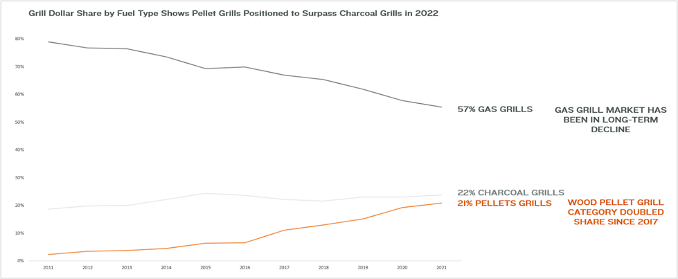
This chart shows the trends in the grill category over the past ten years, and is a good example of storytelling with data. This chart will be used throughout this article.
#1: Use of Color
Charts should only have two colors, and one of them should be gray. The color you choose for your primary point or key takeaway should be dark so that it stands out. I dislike that Excel and other tools default to adding a kaleidoscope of colors as you add dimensions. It’s too hard for the eye to focus, and makes the story muddy. Having a graph that uses a single bold color to tell its story is far more compelling than looking at a rainbow.
One other note on color – don’t feel the need to fill a page with a chart. Leveraging white space, or the absence of color, can oftentimes tell better stories than not.
Example 1 – Color – Storytelling with Data
The use of gray makes the orange (where the story is told) really stand out.
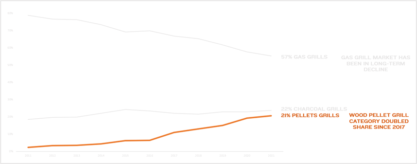
The use of gray makes the orange (where the story is told) really stand out.
#2: Direct Attention
In Western cultures people read left to right. The most common way to look at an image is a Z pattern, where you start in the upper left-hand corner, scan to the right, then go diagonally down and across the image, then finish on the bottom right. Why does this matter?
BECAUSE OF ORDER OF OPERATIONS! You wouldn’t want to hide your key in the bottom right corner if they need that to understand your chart. You’d want to tell them what they’re reading right at the beginning in the upper left-hand corner. If you can consistently make your data read similarly, your audience will better understand it and it gives you more permission to tell stories by focusing attention.
Example 2 – Direct Attention – Storytelling with Data
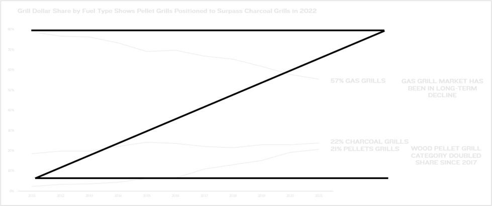
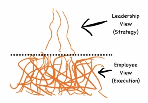
This shows how someone likely reads this chart (in a Z pattern). This is important to understand in how you build the story in your graph.
#3: Titles
The worst titles, in my eyes, are “Sales” or “Marketing Spend” or “Inventory”. Where’s the story? What am I even looking at? You should use the title to tell the story. A better title is something like “Grill Dollar Share by Fuel Type Shows Pellet Grills Positioned to Surpass Charcoal Grills by 2022”. Always use your titles as quick summaries of what the whole slide is about. Let’s break it down:
- Grill Dollar Share – okay, this is about grills and market share
- By Fuel Type – interesting, this is comparing the fuel types between gas, charcoal, and wood pellet
- Shows Pellet Grills Positioned to Surpass Charcoal Grills – oh wow, this is a key takeaway that I should look for in the chart
- By 2022 – clearly gives a time frame to provide context
Example 3 – Titles – Storytelling with Data
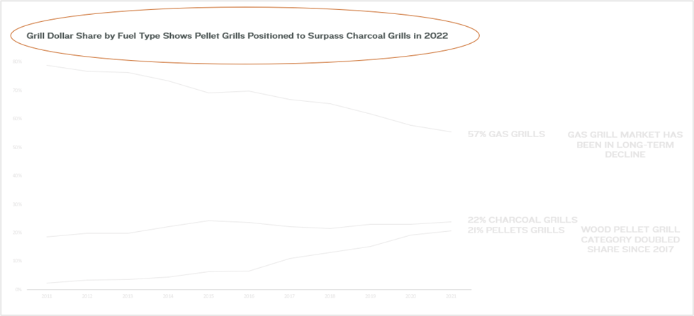
This shows the effective use of a title to explain what the takeaway is from the chart.
#4: Simplify
I love making sweeping statements so I’m going to put it here – most charts with data have too much going on. It’s not just the data but the presentation of that data. There’s added lines, too many numbers, and usually decimals when there doesn’t need to be decimals. The story gets lost in the interpretation, so your job is to make it incredibly easy for your data to be understood.
A few tips:
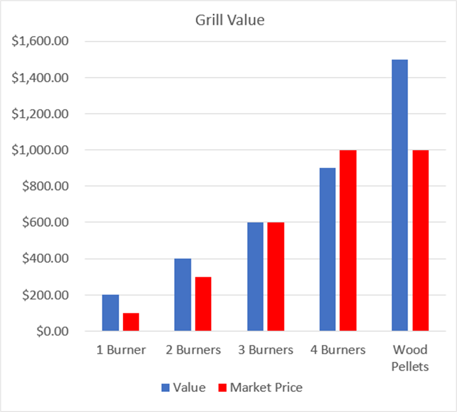
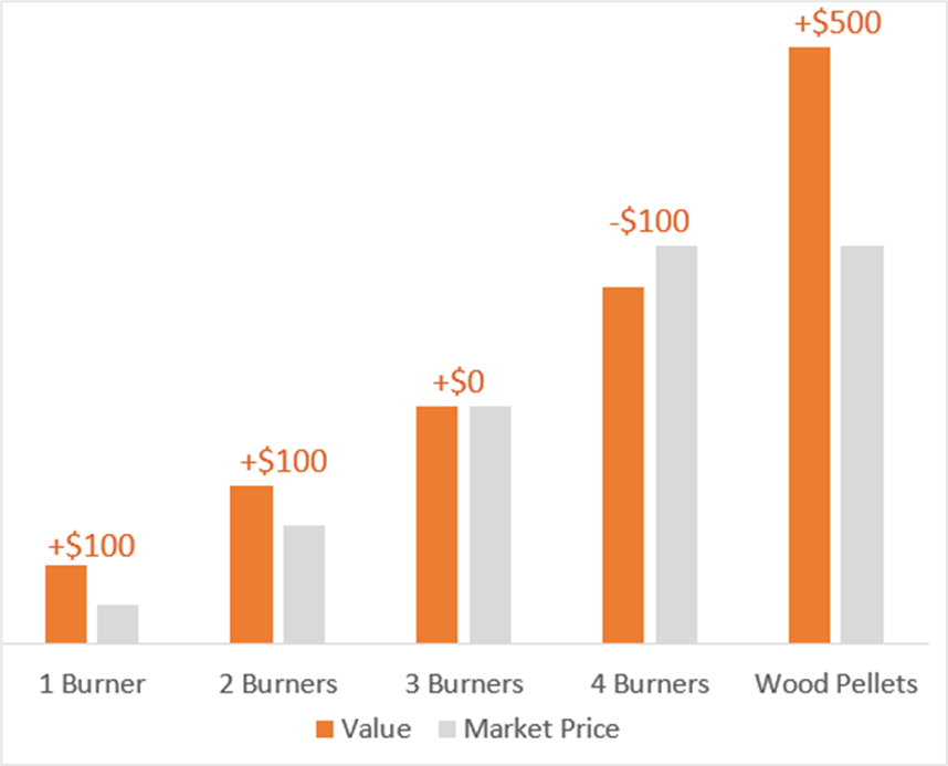
Lines – Excel default to adding running lines across bar charts, line graphs, and other common charts. In almost every instance you should remove these and add data labels to key points in the data instead.
Decimals – most decisions are not made based on decimal percentages. For example, 74.8% just isn’t memorable and doesn’t help you better compare it to 44.8%. Just round up to 75% and 45%. And call out the difference of 30%. That’s a story.
Remove Zeros – The goal is to simplify charts in every way possible. Having 1000, 2000, 3000, etc. takes the brain an extra bit of time to process and muddies up your chart. Just change it to 1k, 2k, 3k, or consider removing the numbers altogether and just label the data you want to call out.
Example 4.1 – Simplify – Storytelling with Data
This is a classic default chart that just has too many elements to be easily understood.
Example 4.2 – Simplify – Storytelling with Data
This is that data cleaned up in a way that’s more readable.
#5: Use of Charts
As a rule of thumb I would recommend you only use bar and line charts. Period. Don’t be tempted by the myriad of other charts that Excel, Tableau, or other products offer.
The main reason is that you want your audience to be able to clearly understand your data and see the story you’re telling. If every chart has a different design there’s a mental burden you’re placing on your audience. It’s better to use a small selection of the same charts repeatedly to help your story shine.
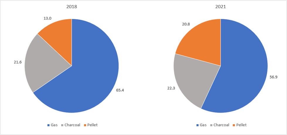
And one more note: pie charts are the least effective charts that exist. It’s hard for our brains to see scale differences, especially in proportion to one another. They’re ineffective at conveying a story. And don’t even get me started on 3-D pie charts!
Example 5 – Charts – Storytelling with Data
These two pie charts show the same data as shown in prior examples, just in a pie chart. Notice how difficult it is to see the changes in fuel type over time? A bar or line graph would be much more useful in telling the story here.
Conclusion
Remember, storytelling is not only possible with data, but should be the goal when presenting data. You can become a master sommelier of storytelling with data as you continue to experiment and learn in this field. By making better use of color, directing attention (remember the ‘Z’ shape), writing better titles, simplifying your charts, and using tried and true charts your storytelling can be more effective.
Also let’s lock arms as businesspeople and vow never to use pie charts again!
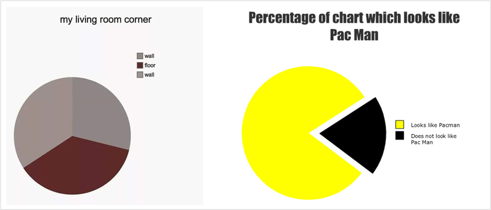
PS: Here is the only appropriate use of pie charts (for fun).
